Friday, 26 April 2013

Album Cover Recreation: The Queen is dead by The Smiths: Digital Vs Analogue.

Whilst researching the work of Andy Earl, I tried to use his work as inspiration for the album cover I was going to be shooting. I noticed he'd shot the cover for This is My Truth Tell me Yours (below) by the Manic Street Preachers, an album I purchased on the first day of its release back in September 1998, and I was interested in recreating this, but it would have been difficult to find three blokes on the day.

Andy Earl: Manic Street Preachers,
It wouldn't be amazingly difficult to reproduce this, but I suppose I would be struggling to find a beautiful landscape such as this around Didsbury. I did think of doing it in a car park, but deemed this an insult to the original.


So I went home looking at all my old CDs, and after some hours scratching my head (not constant: I did do other stuff in between), I came up with the near- perfect choice: The Queen is Dead by The Smiths. This would work both creatively (it was just one man lay down in the darkness) and thematically (John Kiely had already drafted his own brief based on Manchester's musical heritage, culminating in a visit to see Kevin Cummings' photographs of the band itself).

The Original: The Smiths' 1986 album, The Queen is Dead

 I'll start with another link. Like Andy Earl's reworking of Manet's Le déjeuner surl’herbe, The Smiths were renowned for featuring Hollywood idols and other celebrities on their album covers (Pat Phoenix springs to mind here), again playing on the link between music, photography and popular culture. The Queen is Dead album cover features the actor Alan Delon in the 1964 French film  L'Insoumis (so slightly more arty than Pat Phoenix here then). This fits well with the band's target audience: Morrissey was big on literary references (a massive fan of Oscar Wilde), tapping into the existential angst of his acolytes. Somewhat ironic, in today's digital age, where these images and ideas are mass produced and mass printed wholesale. To quote the Manics themselves: "rebellion always sells at a profit" (1)


The idea (or: how?)
Its more than just a man lying down. The facial expression and posture of the model would have to reflect the foppish elegance that Delon seems to exhude here (much like Morrissey himself). Who would the model be for a start? (2). There is a lot of blacks, darks and shadows in the image (subtext: that's practically all it is), so it was important for the model to be wearing something dark (I did think of allowing Richard to use my coat, but a North Face jacket was the opposite of what I was looking for). The shot is obviously a film still, meaning something would have to be done to give the impression of grain that is so prominent in the image, so this (and the darkness in the shot) would need to be controlled in some way during post-processing (more about this later).


The Shoot


"I’m a firm believer that as much as possible should be done on the camera, during the shoot" (Andy Earl)  

I used my Nikon D3100 with my Sigma 50-200mm f4-f5.6, for I knew I decided the 50mm (which would give an effective length of 75mm on a full frame or analogue 35mm camera) would include all I needed in the frame, when stood in and around 4ft away from my model. I used Spot Metering. There was a time where I used this as my default for accuracy. I used it here for the same reason, for I knew I would be shooting from close quarters, thus treating the model like an object, as opposed to a person that makes up a wider scene (reason: there was no wider scene).  

The main thing to consider was the type of lighting required to recreate the mood. The studio was booked on the day of shooting, so our group set about transforming our regular classroom into a makeshift studio, making the Health and Safety issues discussed in my previous post all the more pertinent. A black background (hard matte black paper in a roll) was suspended from two chunky crocodile clips on the far side of the room where the windows are. We chose black as most of the other albums my classmates planned on shooting that day were to be of a similar ilk (e.g. Andy's The Chronic by Dr. Dre). 

  For mine, I needed a black sheet on the floor for Richard (my model) to lie on, and by a strike of luck, this was found in the studio itself (someone's old bed sheet by the looks of it). It needed to be placed randomly to accentuate the folds, so the light could pick up the shadows in said folds. This was relatively simple, meaning it was just a matter of deciding on which light/modifier to use, directing Richard and positioning myself in terms of getting the right camera angle and perspective. I must have misunderstood where the light was coming from at first (see below). 


Camera Settings: f5.6, 1/100th, ISO100, 50mm, spot metering,
Lighting: soft box positioned to the left above Richard's head.
This was the first shot I took of my model, hence why his head is out of frame.
I used the soft box by mistake here, meaning the light was too soft, and not contrasty enough to bring out the shadows. This wasn't helped by the wide aperture or the fact the light was positioned too high.

Try to imagine the model lay down here. I'd also like you to imagine the soft box high above the model, thus rendering the light way too soft.

Camera:  f11, 1/125th, ISO100, 50mm.
Lighting: Deep reflector placed to Richard's right (my left), low down, aiming at Richard's brow, thus sending the rays across his hands a la the original. Got a fuzzy feeling inside when I seen this result, for I knew I'd hit the jackpot, and wouldn't be messing around for ages.
However, the composition still needs work here. I was stood too close to the model, and needed more of his lower half in (below).

Camera: Same
Lighting: Same
This is much better in terms of what is in the frame, but for some reason Richard tilted his head up towards the light. I mustn't blame him too much: he was generally very compliant.

Basically just replaced the soft box with the deep reflector here, and took it off its stand so it would be literally next to Richard's head.

All settings the same.
This was the one I eventually went with because of it nice balance between where the model is within the frame, where the light is falling and where the hands are in relation to one another. It is not perfect: in the original we can see more of Alan Delon's right arm. Progress not perfection.


Post-Processing

1)  I started by duplicating the background layer, selected a black brush, and started painting over the areas that were dark in the original.

Obviously, this is way too explicit.

2) Because the black was too explicit, I applied a white mask to the duplicated layer and, with a mix of opacities, revealed what was underneath to lessen the effect.


A lot more subtle here, but the process was a drawn out one, and reliant upon trial and error.

  3) Then I turned it into a monochrome image by adding a Black and White adjustment layer.


Getting there I'd say


4)  Looking at the original, there seems to be a milky texture to the (35mm) film negative used (3). Indeed this milkiness (my word) was said to look green by a friend of mine (again to do with the negative used), so:

I added a Curves layer, selected only the Green channel, and took the bottom left-hand corner of the curve (darks/shadows) up slightly, giving just a slight green tint to the image (to the point of most laymen not being able to notice it).


Maybe if you look closely

5) The main issue was recreating the film grain, so I used an online tutorial (4) I found on this. I'll try to talk you through it:

i)  I filled the layer with 50% grey (Edit > Fill > Use: 50% grey).
ii)  I then changed the blend mode of the layer to Overlay.
iii) Then I turned the whole layer into a Smart Object, enabling me to make non-destructive changes to it as if it were a separate image and not a layer.
iv) Next was to add Noise to the layer/smart object (Filter > Noise > Add Noise > set to 400%).
v) Then I had to blur the noise so it looked like film grain and not just digital noise   (Filter > Blur > Gaussian Blur: turned right up till I was happy with the result). Et Voila!

Of course then I had to turn the thing into an actual album cover with text etc. Turns out the size of an album is around 4.75 x 4.75 inches, so I just created a black canvas of this size, and then used the Clone Tool to clone the grain texture over the rest of the black canvas I then reduced the size of my finished image to fit into it, thus leaving room for the text. It took a while to decide which font and which colour I needed (arduous process using the colour picker). According to a very obsessive Smiths forum (5) (of which there are many), the font used was Bodoni. I couldn't find this in Photoshop, so I had to make do with Cambri instead.


The Finished Article & Evaluation


  Overall, I am happy with the amount of work I put into this album cover, and also happy with the end result. Although, me being me, I am not ecstatic. From the comparison above, you can see my reproduction pushes all the right buttons in terms of composition, lighting used and the the angle of view I have chosen, but there's just no mimicking of the movie still feel (6). This is testament to the major differences between film negative and digital photography. A while back, our tutor John Kiely asserted that, what we create with our dSLR cameras is- not photographs- but digital images. Initially, I thought this was aimed at undermining everything we have don digitally, but after this experience, I can wholeheartedly agree that digital can never be be as organic (7).  

  I still think it would make a decent album cover for a band, even if it doesn't fully pay homage to The Smith's penchant for the cultural reference. I'm thinking here of other Manchester bands that have built their image using darker, more moody, imagery. With the photography of Kevin Cummings and the designs of Peter Saville, Joy Division's album sleeves were darker and perhaps more iconic, which compares with the absolute blacks of my image. I'm also thinking of the likeness between mine and some of the film stills from Anton Corbijn biopic, Closer, with Sam Riley as Ian Curtis, who bares a vague likeness to Richard I'd say. 


Peter Saville's design for the cover of Joy Division's Unknown Pleasures (1979). This is probably one of the most influential album covers of all time, and fully represents the power of digital imagery.

A film still from Anton Corbijn's film, Control. In keeping with the band's image, Corbijn shot the whole of the film in black and white. Almost like a complete reproduction of the era, I don't think it would have been the same film had he shot it in colour.


This was the main image for the film's poster. Black & White has always been associated with creating mood.


The majority of Corbijn's work is in monochrome. He is responsible for helping to create some of the most well-known bands of the last three decades, including U2 (above), REM and Depeche Mode.


1) Taken from the song, 'Nostalgic Pushead', from the album Gold Against the Soul.
2) Thankfully, my tutor, Richard Gaskill volunteered for the role. God bless him.
3) Remember this is not strictly photography, more cinematography, which means they were working with motion-picture film emulsion. I could say more about this (like how the film processed using the spherical process, rather than the anamorphic, which gives the effect of what photographers call 'barrel distortion'), but I'm willing to make things easier for both me and my readers.
4) http://photoshoptutorials.ws/photoshop-tutorials/photo-effects/natural-film-grain/
5)  http://www.morrissey-solo.com/threads/81172-Morrissey-Smiths-font
6) My Photoshop skills allowing, of course. I did research different ways of getting it to look grainy, but none really cut it.
7)  Our time spent learning about Large Format photography is a more pressing testament to this. Here we are expected to take control and understand everything about the photographic process, lending us greater insight into how photographs are made. We take this for granted with digital, where the settings and what's happening in-camera are more arbitrary facts and figures, and less about how the instrument is shaping the image.


Tuesday, 23 April 2013

Photography in the Music Industry: Andy Earl


Photographic imagery has been implicit within the music industry from as far back as the early part of last century, and nowadays its like the two media have never been separate. The musical artist relies on the visual imagery as a means of conveying what they want to say about themselves and the image they want to promote. One of the biggest staples of the process of creating a certain image is the music video, which acts as an advertisement for a an artist's latest release. An example of the effectiveness of this symbiosis comes from artists such as Madonna, David Bowie and the late Michael Jackson. Without the application of photography and videography, the way these stars have manipulated their images throughout their careers would not have been possible. Of course, since most of an artist's income comes from album sales, the cover of the record is equally as instrumental gaining in creating an image. With the introduction of digital photography, and with the internet now as pervasive as oxygen, the process has become all the more accessible.

  I was reminded of some of the iconic images of the not-so-distant past whilst researching the work of music photographer, Andy Earl. Not only did this remind me of some of the actual covers he had shot, but it gave me insight of how the photograph [digital image] is very much a product of its time. Earl himself had reproduced Edouard Manet’s Le déjeuner surl’herbe (The Luncheon on the Grass) [below] for use as up-and-coming 80s band, Bow Wow Wow, so this seemed a good starting point for introducing my album cover (to follow in next post). 

Le déjeuner surl’herbe (The Luncheon on the Grass) by Edouard Manet.
The album cover for See Jungle, See Jungle by Bow Wow Wow, a great example of how classic art can be reappropriated by photographic media. For a more explicit example of how photography mimics art see my blog post from our trip to London: http://jaspinallphotography.blogspot.co.uk/2012/11/a-trip-to-london-12th-14th-november-2012.html

This was Earl's first album cover, and the one he first gained notoriety for, due to the fact the model bearing her flesh was only 15 at the time, which comes of further proof of the impact the image has in general upon the masses. Ironically, the music industry, and the photograph used to promote it has helped shape the whole of teen culture itself. The moral issue of teens being sexualised by the media is one that keeps coming up, and- since it is the camera that initially takes the picture- surely photography has a part to play in this?

It is evident Earl's work has evolved alongside the inception of digital photography, which is expressed in what becomes a shameless plug of Apple's Aperture on their website:  

"I was never really sure whether digital capture was going to deliver exactly what I needed — whether the blacks would be black enough; whether I’d be able to enlarge the files in the way I wanted. But then the technology got to a point where it was clearly better than film" (1).

He goes on to say that he is now in control, and that he does not have to rely on his lab to reach the right results, for the digital revolution in photography now allows him to assume complete control of his own creative process, and all this is done faster and more efficiently than film:  

I can process, edit and adjust — and then potentially abandon — an image in a matter of seconds.

  This obviously benefits the music industry, in that mores images can be produced and sent to whoever has commissioned them (record label, magazines etc), meaning the images can appear in print or on the internet much more quickly, enticing the public to buy into this new image, and subsequently buy the music (it it has not already been downloaded for free).  


Saturday, 30 March 2013

Health & Safety Implications of Urban Exploration.

As photographers, we sometimes face more and more experimental (and therefore dangerous) shoots. An example of this for me was the time a few weeks ago when I visited Rogue Studios on Chapeltown Street near Piccadilly Basin in Manchester's City Centre, with my friend, the local artist, David Lowther. The site is formerly a disused mill, now rented to artists as studios. Tapping into the craze for urban decay and exploration, I shot some pretty decent images there, which can be seen below along with some I did a while back on an old train site in Oswestry, Shropshire. I hope these also give an idea of the obvious Health and Safety implications present in this form of photography.

f5.6, 1/80th, ISO400, 24mm.
All kinds of nasty substances that could make for very itchy skin. I know this from personal experience: at one time I had an allergy to certain types of paper (Impetigo); often old books from old library stacks. The blue book to the right you see here is actually a copy of the Koran. The dust here could also be inhaled.

f5.6, 1/50th, ISO400, 18mm.
Dangers from old paint and decaying, brittle woodwork. Also, Asbestos can be presetn in any building built before 2000 (1). This is usually found in wall panelling in this case. Asbestosis is where the build-up of its spores can cause a scarring on lung tissue through breathing.

f5.6, 1/50th, ISO400, 18mm.

f5.6, 1/50th, ISO400, 18mm.
It was more the floorboards I was concerned about the most. From the moment I entered I knew this was going to be the case. Some of them were missing for a start. Obviously, one has to be mindful of losing one's footing.

f5.6, 1/50th, ISO400, 18mm.
Look to the bottom right of this picture. This is where the floorboards were missing. What a shot, though.

f5.6, 1/50th, ISO400, 18mm.

f5.6, 1/50th, ISO400, 18mm.

f5.6, 1/50th, ISO400, 24mm.
  It is somewhat ironic discussing Health and Safety in this kind of environment, due to the fact that we are not meant to be there in the first place. Indeed, I'm sure for some people this is the appeal.

Some of my past exploits shooting locations of decay (or: decaying locations. Whichever works best):
Watch this Space!!!!!!


1)  http://www.hse.gov.uk/asbestos/hiddenkiller/where-is-it-found.htm

Health & Safety in Photographic Practice

As with any type of work, photography still has to follow the usual guidelines when it comes to keeping its practitioners and models safe. Below are just some of the key acts and guidelines that need to be adhered to to ensure safe practice. Obviously, we are mainly talking about digital photography here, but I may nod my head in the direction of analogue where I see fit.

Provision and Use of Work Equipment Regulations 1998 (PUWER).

*  All equipment used in the studio or on location should be fit for purpose (e.g. flash units, lights, modifiers etc) as detailed in any manuals or documentation that came with the item. It should also only be used for the purpose it is designed to fulfil.

*  Everyone using the equipment should have received the correct prompts on how to use it, including warnings on potential risks etc (for us, we were given a full day induction in H&S in the studio).

*  Should ensure dangerous loose parts of electrical equipment is kept safe at all times (i.e. the triggers for the flash heads).

*  All portable electrical appliances in and out of the studio should be PAT tested at least once a year (this also means any computers used for editing digital images).

*  The temperature of any room where electrical equipment should be kept at an optimum at all times. This may be difficult on location shoots, as camera and flash batteries are known to run down quicker in cold conditions.

Health & Safety at Work Act (1974)

  This is considered the main act covering primary health and safety in the UK, also includes a number of other acts and statutory instruments. In digital photography this mainly concerns itself with the computers/screens used to edit our images, not to mention all of the usual precautions and guidelines associated with office work and spending large amounts of time in front of a computer. For example:

*  All display screens would have to be non-flicker (Display Screen Equipment Regulations 1992).

*  All lights in the rooms would need to be non-glare, so as not to reflect from the screen you sreen using.

*  All screens should be positioned at a 90 degree angle from windows and other light sources (1).

*  Walls painted in a neutral grey (preferably 18% grey) to prevent colour casts. Although I suppose this is more relevant the creative process.

*  It advised those using computer screens should look up from the screen at something else every 15 minutes to reduce the risk of eyestrain.

*  All chairs should be ergonomically sound, for "people weren't designed to sit at a computer all day" (2). Like display screen technology, this is to lessen the risk of back pain and fatigue.


Control of Substances Hazardous to Health (COSHH) (2002) 

  Generally speaking, this aims to safeguard those using or coming into contact with any substances (dust, fumes, gases, liquids) that are potentially damaging to health. Some of these cause damage to the skin, whereas gases may cause respiratory problems etc. This is an aspect of Health and Safety that you would expect to find on any induction course for any job in the country.

  In terms of photography, we must mention analogue here (despite the fact this is largely a digital course), and how the dark room is full of such chemicals.  This means being mindful of the way the chemicals in the dark room are packaged and stored (NB: probably not the best idea to store dangerous chemicals in other bottles), paying particular attention to the signs and symbols their bottles are labelled with. Below are some of the most common of these that would be associated with dark room practices:
Dangerous to the environment 
Flammable

Toxic          
Corrosive
  It is not recommended to use one's hands when handling dark room chemicals, so either tongs or the use of latex gloves, aprons and eye protection (Personal Protective Equipment- PPE) is preferable, despite the fact all photographic chemicals these days are heavily diluted.

  The major suppliers of these chemicals are obliged to provide Safety Date Sheets (SDS) with all their chemicals, and these can be very helpful in detailing what they are made of should they need to presented to a member of staff at A&E in the event of an emergency. Ilford (supplier of chemicals and papers) also has detailed safety information on their website.

Risk Assessments

  As in all workplaces, all photographic practice is expected to undergo necessary risk assessments prior to any work being carried out. This can be as simple as asking models and subjects (at an event or in the studio) to sign model release forms as a means of the photographer safeguarding him/herself against those unhappy with where and how the images are used.

  During my Broughton House shoot for the Interior Location brief I was obliged by both the manager and the colonel to: 1)  have my tutor email them confirming who I was; 2) have my college ID on me at all times and 3) ask all residents and staff to sign a model release form prior to being photographed. After all, the home has strict guidelines on confidentially, being a social care provider.

  Of course, the main risks in photography are the more tangible risks in the studio and on location, such as trips, falls and electrical overload. For this reason, the risk assessment often comprises five main parts (as with in other industries): 1) Identifying hazards (something with a potential to cause harm); 2) Decide who may be harmed; 3) Evaluate Risks and decide on precautions (risk = likelihood of the hazard actually causing harm); 4) Record findings and implement them; 5) Review assessments and update if necessary. I will now take my Action Man studio brief as an example of this, due to the fact it was me who booked it, so it was me taking sole responsibility for my own safety.

1)  Hazards Identified:  
 Lots of wires in the same small space giving way to trips and falls or lights knocked over and bringing down the whole set-up; objects on the table likely to fall (boom arm of tripod liable to toppled onto table; possibly injuring body); using lights with too many amps for one socket; breakage of bulbs (trodden on, cuts from glass); touching hot bulbs and reflectors with bare hands; straining arms attaching heavy soft boxes; banging head on lights; low light in studio (difficult to see what I'm doing).

2)  Who might be harmed?
Me first of foremost. Other tutors/students popping in and out on the day, as well as those stepping on broken glass after this; my camera and college's equipment; Action Man himself (arf).

3)  Evaluation of risks and possible precautions:
Keep all wires in sight and tucked-away safely; make sure all electrical equipment and their wires are completely necessary; tighten any tripods and light stands to ensure they don't come loose and topple over; ensure backdrop items are all safe and self-contained within one space; not too many plugs daisy-chaining together (although I'm sure Dave Sweeney would have something to say about this on the day); turn lights down/off before changing attachments and/or use a piece of material to handle hot objects; turn on main lights for any important changes.

4)   Record Findings and Implement them:
I have just done this above.

5)  Review your assessment and update if necessary:
Obviously, if I was using the studio on a more regular basis, I would be able to carry-out an ongoing assessment of the risks involved. Suffice to say I have struggled with attaching soft boxes to flash heads and burnt my hands many times now.
  
 
  In the following post I will show some images from a shoot I did at Manchester's Rogue Studios, pointing out some of the dangers present in what was ostensibly a disused mill.


1)  http://www.crossbowcorporate.com/anti-glare-screens/
2)  http://www.weareworkwise.co.uk/dse-risk-assessment.php


Thursday, 21 March 2013

Textured Portrait in Photoshop (Composite Images)

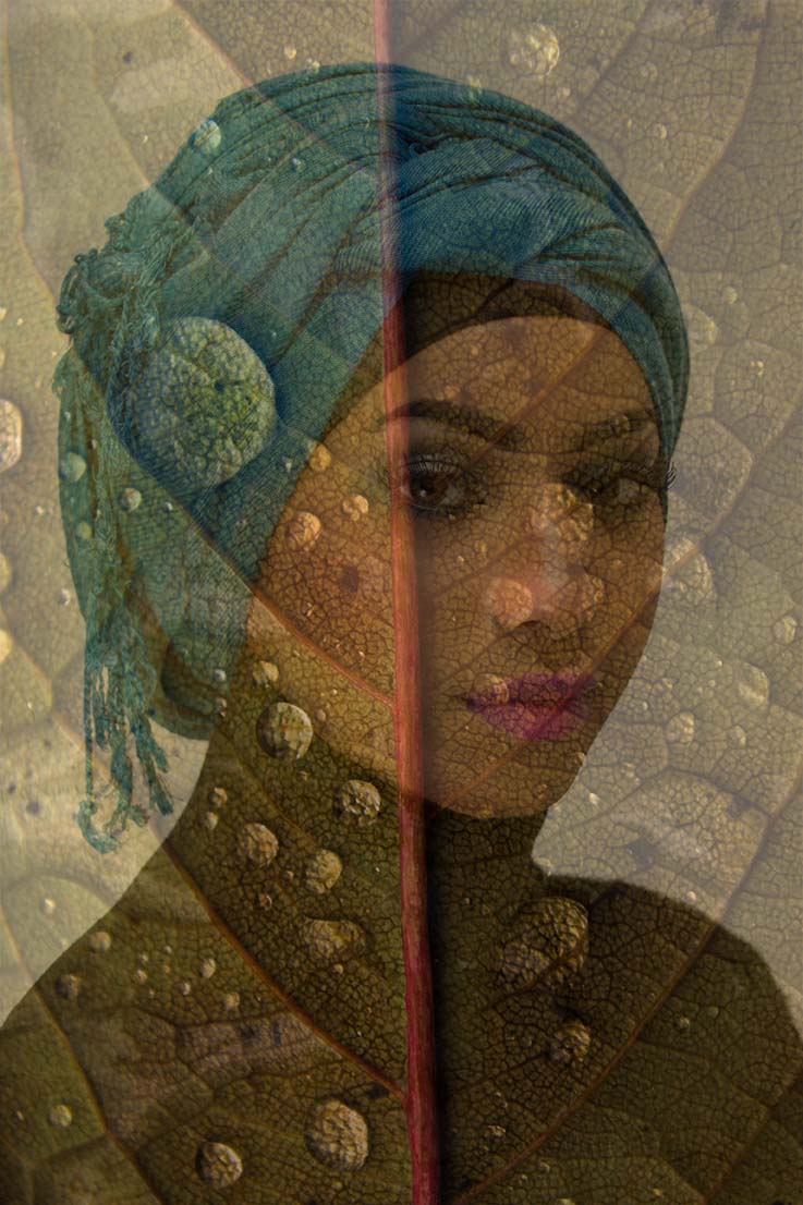
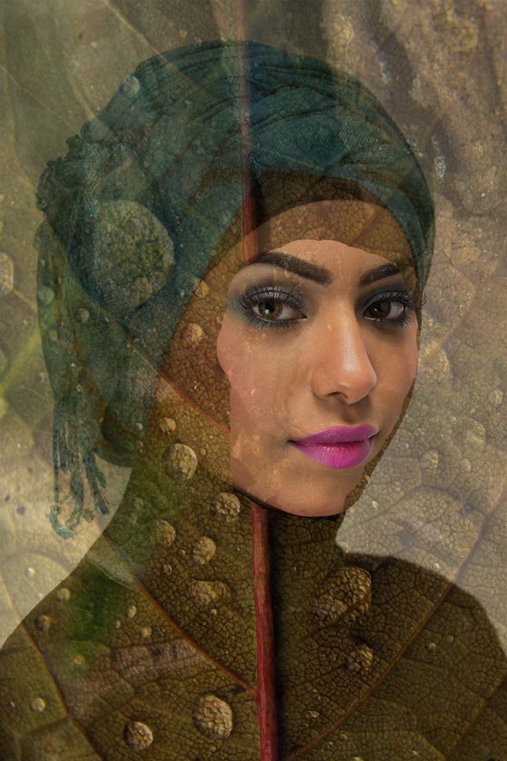
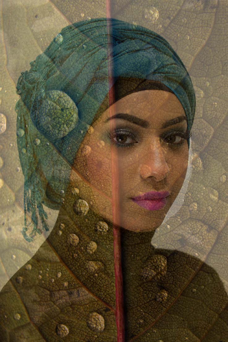
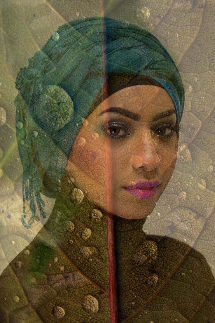
This was a worthwhile exercise, taking in the combined skills of studio lighting, knowledge of portraiture, identifying and photographing textures, and the tools picked-up to set me in good stead for producing a quality montage for Unit 27. For this reason, you might like to think of this post as an introduction to Unit 27. Below is the finished textured portrait, followed by an in-depth break-down of how I made it possible.

The Portrait

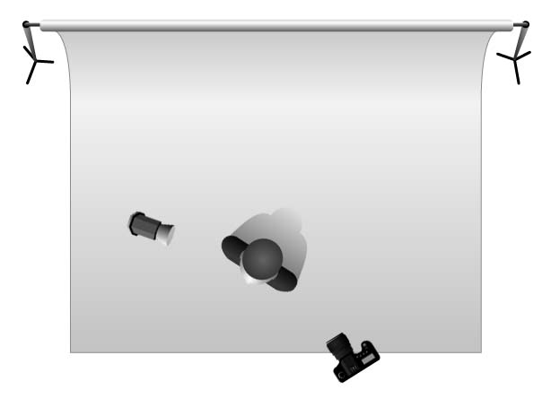
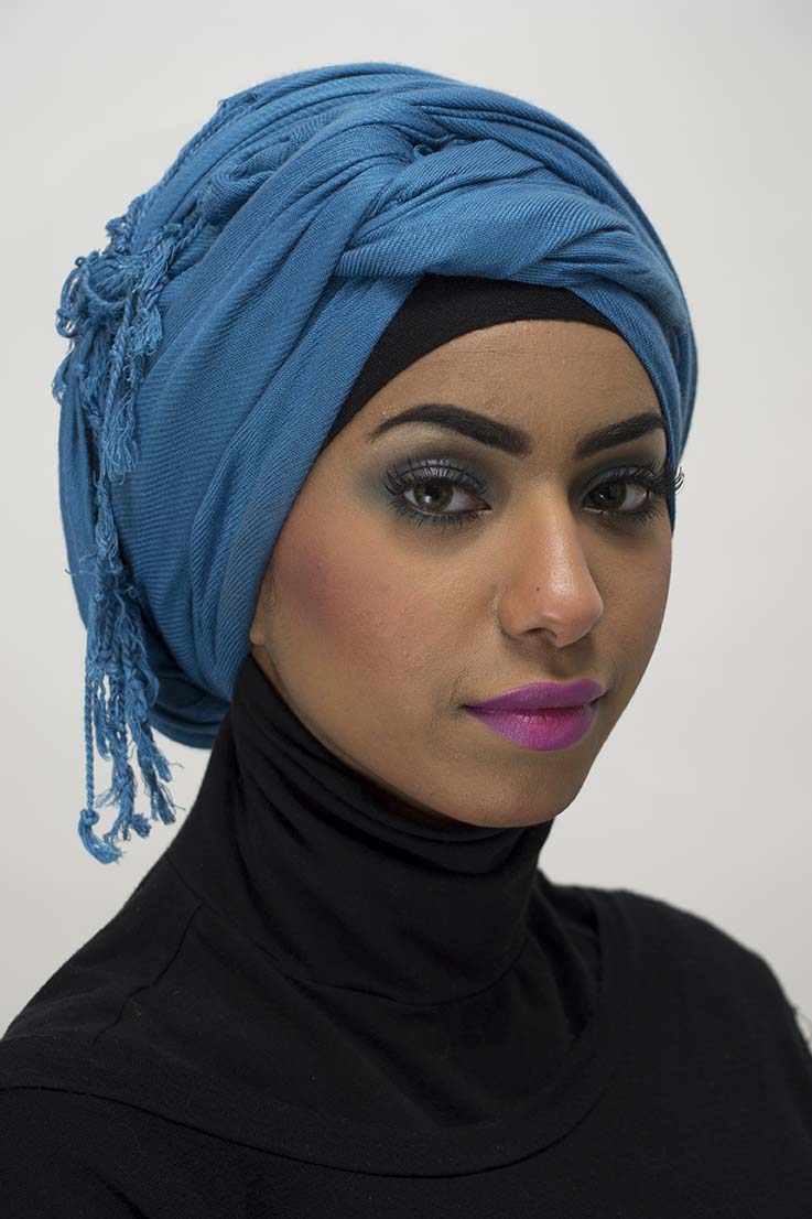
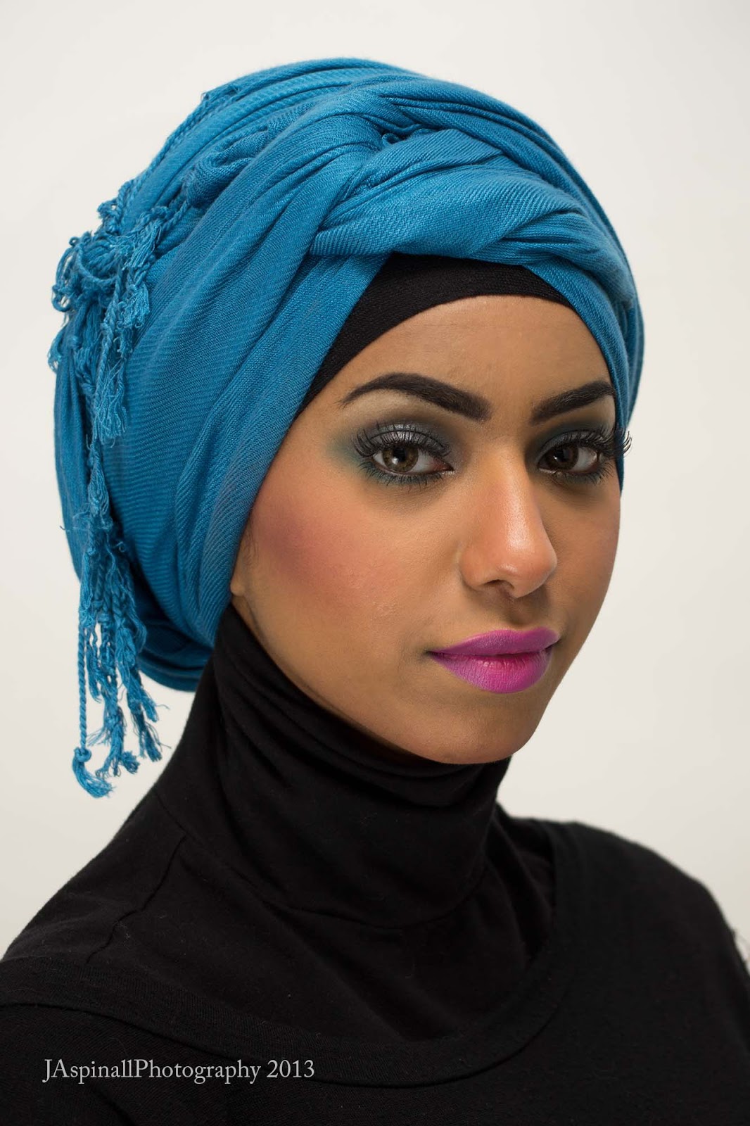
I chose Bezma as my model because of her captivating eyes and youthful look. I shot her in the studio, using two soft boxes at either side of my subject (see below for set-up). I was rather pleased to discovered at this point that my Metz AF 50 flashgun was able to trigger these two lights, meaning I did not have to attach the trigger. People were rushing me so they could shoot their own portraits, but this only brought out the best in me. Below is the image I chosen straight from camera without any editing followed by the one edited using Adobe Camera RAW and the main Photoshop.

f5.6, 1/60th, ISO100, 62mm, Auto White Balance, Spot Metering.
Increased exposure, lights, highlights and contrast in the main. These are the things I use most often in ACR,. I like the way Lights compliments the actual lights used in the studio. It is basically a fill-light. In CS6 I used the Spot Healing tool to remove any blemishes from Bezma's skin, before adding my usual Guassian Blur Filter with a black mask to soften her skin. The last thing I usually do is use the Sharpen tool to very subtly sharpen the eyes. Less is more.

Soon after taking the portrait I went out to look for appropriate textures I could layer over the top of it, carrying with me the sage advise of John Kiely: "make sure the colours of the textures are within the same colour space" (I paraphrase). Below are my chosen textures (which were basically given the Vibrancy and Highlights treatment in ACR, for they were shot RAW).


In Photoshop, the first thing I did was ensure all the images that I wanted to blend together were the same size. For this reason I saved them all at 300dpi at full quality. In order to layer the images on top of one another in the simplest way possible, recorded the size of the portrait (3071 x 4608 pixels) and made sure my other pictures were the same size. I discovered this technique last summer when making some other collages for Level Two.

I knew I wanted the leaf with the water droplets on it as the main background, so stuck it on there and reduced the Opacity to 60%, which I know from previous experience is a nice level (below).


You can see that- once the leaf is layered onto the portrait- the face is covered. This is where the Eraser tool comes into play. I had to experiment quite a lot with this tool, for every time I layered a new image onto it, I had to erase parts of it to reveal the face again.

This shows the importance of reducing the opacity of the Eraser tool itself, lending me more scope. The eyes are quite evidently revealed here, but the 'blend' is too harsh. .


This is what I'm talking about: the transition where the eyes are is a lot more subtle, and on the road to becoming the finished product.

After the first leaf was in place, I added the second one, this time being more creative by using the Graduation tool to add more colour to the top left-hand corner. By selecting this tool and drawing a diagonal line from the top and working into the start of Bezma's head, I was able to then reduce the opacity, so it starts strong and becomes more subtle, so as not to interrupt the face the way the first leaf did (this stage below).

Doesn't look a great deal different with the Opacity lowered, but you may be able to nite more going on in the top left.

For the addition of the tree bark (whose brown fitted well with the different shades of green from the leaves), I rotated the image horizontally for a change, for I only wanted the part between the top of Bezma's head and the end of the canvas filling in slightly. I was able to do this by changing the arrangement of Photoshop's workspace to Float all in Windows (Window > Arrange > Float All in Windows), which I find absolutely essential when working with multiple images. Then I reduced the opacity again for this new layer.

This is how I came out with the finished image seen at the top of this post.


Wednesday, 20 March 2013

Studio Photography Brief: Final 3 still lives and Evaluation.


This post is dedicated to discussing how I made (and selected) my three remaining still life images for submission: flower, glass and jewellery.

Glass

Glass is said to be one of the most difficult things to photograph, and it is said that we are not actually aiming to photograph the glass itself, rather the reflections and the shadows that come from them, to ensure the actual glass stands out. We were shown a number of different techniques (and used a range of different media and props) during this session, but I opted for the simple blue glass bottle and green mottled glass paperweight set against a white background (below).

Camera Settings:  f11, 1/100th, ISO100, 62mm, WB: Flash.
Lighting: two soft boxes directed at subject from either side; one deep reflector underneath subject, at an angle pointing upwards; black card to either side of subjects.

I wasn't able to find an icon for the glass table. My Apologies.

I suppose this set-up is similar to the one for the Action Man 'still life', in that it has one very light aimed at the subject (in this case deep reflector under the glass table), along with two soft boxes. The main use of the soft-boxes here, however, was to provide a soft and even light to the glass from both sides with minimal reflections. Commercial product photographer, Alex Koloshov, suggests using a strip soft box to create a vertical catch-light as opposed to the square we see in my subjects (1). The use of any other modifier would be sure to render the edges and highlights too harsh, which is why the deep reflector is placed under the glass table, directing the light through the whole glass. The black reflectors either

As always, I opened the image in Adobe Camera Raw first to increase the Contrast, Lights and Highlights (keeping an eye on the 'clipping' of these), and also increased Shadows (to make the reflection on the table more prominent) and Darks (the texture of the mottled glass needed accentuating in my view). In Photoshop, I used two Brightness/Contrast layers with black masks (Alt + mask): one to ensure the white background was absolute white- painting in the bottles with a white brush so they wouldn't be too bright- and the other to accentuate the reflection of the bottles in the table. The last thing was convert the colour profile to DS Lustre, and brighten the image by +30, ensuring the correct brightness once printed. 

I did try other subjects/compositions before this one, but they just weren't strong enough. Below are just some of these.

The same subjects shot using a black background didn't have nearly the same effect. For one, the black highlights the dust on the table, and the image lacks the clinical feel.


This was one I began editing, before washing my hands of it and opting for the one I finally chose. It just goes to show you can come back to images and see them in a different light (pardon the pun), for I revisited it just now and finished editing it, darkening the background and revealing the edges of the bottle for definition with the use of a mask. The two soft boxes make for some brilliant catch-lights.


Flowers

  I've already shown some of Mapplethorpe's flowers, and the personality he managed to inject into them via his unique style. We also looked at Irving Penn's (1917-2009) work on the subject, whose work I was familiar with from Level One. Flowers are not something I'm naturally interested in, but once I noticed Penn's concentration on dead and decaying flora (in enlightening compositions), I knew the concept was something I could get my teeth into. I have included some examples below, along with my annotations as a way of 'segwaying' into my own choice.


Much like Mapplethorpe, Penn gave flowers their own unique personalities. Here three dead Gerberas huddle together like models, almost conscious of the process of photography they are subject to.


Again, the dying flowers are almost aware of their certain fate, as they face death, albeit still conscious and bashful as models in front of the lens. They are being subjected to something. Makes me think whether- in photography- there is more life in dead flowers than with those that are alive. In the words of the art critic Rosamund Bernier, Penn brought "poetry to immobility" (2)

One thing present in all the subjects in his seminal book on flowers is the lighting used. He was renowned for using minimal backgrounds, and for me this only serves to highlight the perfect blend of softness, definition and contrast as a way of evoking the splendour of a flower's texture.


  Texture was what I decided most interested me in our flower sessions. It was the texture of a rose I submitted (below), which was shot using one of the college's Medium Format cameras, the Mamiya RZ67 with a 17MP digital Leaf Valeo back, for extra clarity (perfect for highlighting the rose's texture).


Camera Settings:  f5.6, 1/125, ISO50
Lighting:  Light above subject (opposite camera) with barn-doors and honeycomb attached; beauty dish to left of camera to highlight flower; gold reflector to add warmth to the highlights (below).


The barn-doors ensures the light glances over the flower, highlighting its texture; the honeycomb diffuses said light,, preventing it from being too harsh.
It was the spiky death of this flower that so attracted me to it. Death has long been celebrated in art, and here I sought to highlight the beauty of it, reminding us that death is part of life. Looking at the print now, I notice an almost Tim Burton (Nightmare Before Christmas) feel to it, the way the textured green of the main petal (accentuated by increasing Vibrancy and Saturation) seems to be stretching in animated fashion, covering its head to preserve its dignity. There could also be parallels drawn between this and William Blake's illustration that accompanies the poem 'The Sick Rose', included in his Songs of Experience (below). 


I certainly think there is a project in here somewhere:, which would involve layering (read: wrapping) Blake's text around my own rose in Photoshop. A possible contender for the Montage unit.
The only reservation I have about this image is that it is too bright, which I feel detracts the actual matte-like texture. Indeed, upon opening the TIFF in ACR, I noticed there was some clipping of the highlights, specifically in the upper red petal. I did attempt painting this away using the Adjustment Brush with a reduced exposure, but it looked too unnatural. I did take a few shots of this composition (below), but ended-up opting for the a brighter one.


This looks better on screen (more like Penn's lighting), but the main reason for upping the lights and highlights of the final (and lowering the shadows and dark points) was to ensure the print didn't come back dark. One day I'll get my screen calibrated. (This is edited by the way).

There were a few I did using a range of different compositions also, but way inferior to the final image (below).


The light seems to have picked-up the texture of the wood here more than the actual flower. The composition is dreadful too. It is pretty much just a dead flower. No poetry or sense of the aesthetic like the final one. Not edited.
Better composition here, but looking at a subject placed to the right of the frame makes me feel uneasy. And I feel the bud of the rose is too close to the camera. Still, at least its blossoming here.


I think I was finally getting somewhere here. A wider shot that includes the whole rose works a lot better. And the petals that have become detached from the stalk also make an extra focal point for the viewer. However, compared to my final one I think it lacks impact and drama. If the one above was too close, then this would be too far away, meaning we cannot engage with it as much.


The second part of our flower sessions were spent experimenting with different coloured gels, which were applied to the main key light (deep reflector) aimed directly at the flower in question. A lot of this stuff was done in the main studio space with my own camera and lenses. The set-up is pictures below.

Shooting table atop an ordinary table against a white backdrop; deep reflector with barn doors and honeycomb to my right; deep reflector with range of coloured gels (blue & green) applied; camera on tripod in centre.
Some of these came out quite well, if a little sparse and lacking in any objects to accompany the flower. Below are some of the ones I felt worthy of editing. Note how narrow the apertures I've used again (more about why this is in my Action Man still life post).


f20, 1/100th, ISO100, 75mm.
The subtle blue gel adds a nice tint to a red rose, possibly because we're dealing with the three main colours of the gamut in one image of an object of natural beauty (Red, Blue, Green). I opened this in ACR to bring out the contrast, shadows and darks (and also warmed the WB so the blue didn't dominate too much), but not much with lights and highlights due to the fact those within the inner petal were clipped to start with. I had the lights too bright. Still, nice image, just not good enough to submit.
f25, 1/100th, ISO100, 75mm.
The green gel doesn't work half as well as the blue gel because of the fact green is prominent in the subject to start with. Adding a blue to a green and red subject was a way of throwing a new colour into the range of colours, making them "gel" together (pardon pun). Way too green this. 


Jewellery


I wasn't exactly frothing at the mouth at the prospect of photographing pieces of jewellery. In fact it was my least favourite of all the still lives. Still, the aim of the unit is was to showcase a range of different media, so photograph jewellery I did. Below is my final choice, although I didn't have much to choose from.


Camera Settings:  f22, 1/160, ISO100, 60mm (on Nikon 60mm f1.8 macro lens). Spot Metering.
Lighting:  Honeycomb with barn doors from back (attached to backdrop); beauty dish from left of camera aimed 45 degrees at subject; gold reflector.    

Like the flower, the barn doors with honeycomb ensured a directional and diffused soft light from the back, whilst the beauty dish (along with its centre diffuser) gave a more prominent light to the subject, helping me to pick up the fine detail with the Nikon Macro lens. 

As with all still life set-ups, the background and any accompanying objects used in the shot were paramount. The first half of the session focussed on us going out into the great outdoors and collecting various bits and pieces that could would make the jewellery stand out. I was lucky enough to find a huge log, full of moss and countless amounts of interesting crevices and protruding bit. For extra interest I also chose some of the tree bark used by the college to decorate its tree-lined areas. This was all well and good, but my only criticism with this in my final shot was the similarity in colour of the log and the earrings I photographed. Below are some that gave a slightly better contrast between subject and background.


Note how the silver and stones stand out more against the brown log background.

Although the composition leaves a lot to be desired here, again the pendant stands out a lot more against the background. This was never going to be a final choice, mind, for the subject lacks the warmth of my chosen one. This is because I had not yet brought the gold reflector into the mix.

I think it may just have been the poor choice of subjects that turned me off this particular studio session. I mean it stands to reason that students are not going to leave their best jewellery at college for people to photograph. And so, just as a bad workman blames his tools, I am fully prepared to blame the shoddy subjects for what I deem uninteresting or garish images of jewellery (below). 


Too plain. Can tell its one of my first efforts. Don't think the breeze block does much for the subject either. A breeze block is more associated with 'urban chic' like a modern watch or something.


This is not as bad as I'm making out. If only the edge of the shooting table wasn't in the frame. I think warming the White Balance considerably in ACR does a lot for a jewellery image.


Wow! Where did this one spring from? I certainly hadn't noticed this when I was choosing one to print. Had I my time over again, I would have opted for this instead: there's a lot more going on (with the different shapes and textures), and the composition works on the 'rule of thirds' basis.

Overall, I feel I have learned lot from our studio sessions, but conversely I don't feel I have scratched the surface in things I wouldn't mind trying. I'd like to spend more time in the studio with a range of different subjects, making best use of different lighting techniques. I'd really like to push new ways of doing things, and try different combinations of lights. Its like cookery in this respect: its all well and good following the instructions to the letter, but at the end of the day, the best dishes succeed from bringing one's own flavours to the ingredients. Needless to say, these sessions have really whetted my appetite for more experimentation in the future. 


1) http://www.pixiq.com/article/product-photography-tipstricks-shooting-glass-on-black
2)  http://www.latimes.com/entertainment/news/arts/la-me-irving-penn8-2009oct08,0,1536282.story?page=2