 |
| It wouldn't be amazingly difficult to reproduce this, but I suppose I would be struggling to find a beautiful landscape such as this around Didsbury. I did think of doing it in a car park, but deemed this an insult to the original. |
So I went home looking at all my old CDs, and after some hours scratching my head (not constant: I did do other stuff in between), I came up with the near- perfect choice: The Queen is Dead by The Smiths. This would work both creatively (it was just one man lay down in the darkness) and thematically (John Kiely had already drafted his own brief based on Manchester's musical heritage, culminating in a visit to see Kevin Cummings' photographs of the band itself).
I'll start with another link. Like Andy Earl's reworking of Manet's Le déjeuner surl’herbe, The Smiths were renowned for featuring Hollywood idols and other celebrities on their album covers (Pat Phoenix springs to mind here), again playing on the link between music, photography and popular culture. The Queen is Dead album cover features the actor Alan Delon in the 1964 French film L'Insoumis (so slightly more arty than Pat Phoenix here then). This fits well with the band's target audience: Morrissey was big on literary references (a massive fan of Oscar Wilde), tapping into the existential angst of his acolytes. Somewhat ironic, in today's digital age, where these images and ideas are mass produced and mass printed wholesale. To quote the Manics themselves: "rebellion always sells at a profit" (1)
The idea (or: how?)
Its more than just a man lying down. The facial expression and posture of the model would have to reflect the foppish elegance that Delon seems to exhude here (much like Morrissey himself). Who would the model be for a start? (2). There is a lot of blacks, darks and shadows in the image (subtext: that's practically all it is), so it was important for the model to be wearing something dark (I did think of allowing Richard to use my coat, but a North Face jacket was the opposite of what I was looking for). The shot is obviously a film still, meaning something would have to be done to give the impression of grain that is so prominent in the image, so this (and the darkness in the shot) would need to be controlled in some way during post-processing (more about this later).
The Shoot
I used my Nikon D3100 with my Sigma 50-200mm f4-f5.6, for I knew I decided the 50mm (which would give an effective length of 75mm on a full frame or analogue 35mm camera) would include all I needed in the frame, when stood in and around 4ft away from my model. I used Spot Metering. There was a time where I used this as my default for accuracy. I used it here for the same reason, for I knew I would be shooting from close quarters, thus treating the model like an object, as opposed to a person that makes up a wider scene (reason: there was no wider scene).
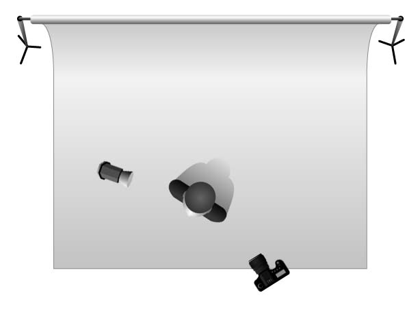
The main thing to consider was the type of lighting required to recreate the mood. The studio was booked on the day of shooting, so our group set about transforming our regular classroom into a makeshift studio, making the Health and Safety issues discussed in my previous post all the more pertinent. A black background (hard matte black paper in a roll) was suspended from two chunky crocodile clips on the far side of the room where the windows are. We chose black as most of the other albums my classmates planned on shooting that day were to be of a similar ilk (e.g. Andy's The Chronic by Dr. Dre).
For mine, I needed a black sheet on the floor for Richard (my model) to lie on, and by a strike of luck, this was found in the studio itself (someone's old bed sheet by the looks of it). It needed to be placed randomly to accentuate the folds, so the light could pick up the shadows in said folds. This was relatively simple, meaning it was just a matter of deciding on which light/modifier to use, directing Richard and positioning myself in terms of getting the right camera angle and perspective. I must have misunderstood where the light was coming from at first (see below).
1) Taken from the song, 'Nostalgic Pushead', from the album Gold Against the Soul.
2) Thankfully, my tutor, Richard Gaskill volunteered for the role. God bless him.
3) Remember this is not strictly photography, more cinematography, which means they were working with motion-picture film emulsion. I could say more about this (like how the film processed using the spherical process, rather than the anamorphic, which gives the effect of what photographers call 'barrel distortion'), but I'm willing to make things easier for both me and my readers.
4) http://photoshoptutorials.ws/photoshop-tutorials/photo-effects/natural-film-grain/
5) http://www.morrissey-solo.com/threads/81172-Morrissey-Smiths-font
6) My Photoshop skills allowing, of course. I did research different ways of getting it to look grainy, but none really cut it.
7) Our time spent learning about Large Format photography is a more pressing testament to this. Here we are expected to take control and understand everything about the photographic process, lending us greater insight into how photographs are made. We take this for granted with digital, where the settings and what's happening in-camera are more arbitrary facts and figures, and less about how the instrument is shaping the image.
 |
| The Original: The Smiths' 1986 album, The Queen is Dead |
I'll start with another link. Like Andy Earl's reworking of Manet's Le déjeuner surl’herbe, The Smiths were renowned for featuring Hollywood idols and other celebrities on their album covers (Pat Phoenix springs to mind here), again playing on the link between music, photography and popular culture. The Queen is Dead album cover features the actor Alan Delon in the 1964 French film L'Insoumis (so slightly more arty than Pat Phoenix here then). This fits well with the band's target audience: Morrissey was big on literary references (a massive fan of Oscar Wilde), tapping into the existential angst of his acolytes. Somewhat ironic, in today's digital age, where these images and ideas are mass produced and mass printed wholesale. To quote the Manics themselves: "rebellion always sells at a profit" (1)
The idea (or: how?)
Its more than just a man lying down. The facial expression and posture of the model would have to reflect the foppish elegance that Delon seems to exhude here (much like Morrissey himself). Who would the model be for a start? (2). There is a lot of blacks, darks and shadows in the image (subtext: that's practically all it is), so it was important for the model to be wearing something dark (I did think of allowing Richard to use my coat, but a North Face jacket was the opposite of what I was looking for). The shot is obviously a film still, meaning something would have to be done to give the impression of grain that is so prominent in the image, so this (and the darkness in the shot) would need to be controlled in some way during post-processing (more about this later).
The Shoot
"I’m a firm believer that as much as possible should be done on the camera, during the shoot" (Andy Earl)
The main thing to consider was the type of lighting required to recreate the mood. The studio was booked on the day of shooting, so our group set about transforming our regular classroom into a makeshift studio, making the Health and Safety issues discussed in my previous post all the more pertinent. A black background (hard matte black paper in a roll) was suspended from two chunky crocodile clips on the far side of the room where the windows are. We chose black as most of the other albums my classmates planned on shooting that day were to be of a similar ilk (e.g. Andy's The Chronic by Dr. Dre).
For mine, I needed a black sheet on the floor for Richard (my model) to lie on, and by a strike of luck, this was found in the studio itself (someone's old bed sheet by the looks of it). It needed to be placed randomly to accentuate the folds, so the light could pick up the shadows in said folds. This was relatively simple, meaning it was just a matter of deciding on which light/modifier to use, directing Richard and positioning myself in terms of getting the right camera angle and perspective. I must have misunderstood where the light was coming from at first (see below).
 | ||
| Camera Settings: f5.6, 1/100th, ISO100, 50mm, spot metering, Lighting: soft box positioned to the left above Richard's head. This was the first shot I took of my model, hence why his head is out of frame. I used the soft box by mistake here, meaning the light was too soft, and not contrasty enough to bring out the shadows. This wasn't helped by the wide aperture or the fact the light was positioned too high.
|

 | ||||||||||||||||||||||
| Camera: f11, 1/125th, ISO100, 50mm. Lighting: Deep reflector placed to Richard's right (my left), low down, aiming at Richard's brow, thus sending the rays across his hands a la the original. Got a fuzzy feeling inside when I seen this result, for I knew I'd hit the jackpot, and wouldn't be messing around for ages. However, the composition still needs work here. I was stood too close to the model, and needed more of his lower half in (below).
|


2) Thankfully, my tutor, Richard Gaskill volunteered for the role. God bless him.
3) Remember this is not strictly photography, more cinematography, which means they were working with motion-picture film emulsion. I could say more about this (like how the film processed using the spherical process, rather than the anamorphic, which gives the effect of what photographers call 'barrel distortion'), but I'm willing to make things easier for both me and my readers.
4) http://photoshoptutorials.ws/photoshop-tutorials/photo-effects/natural-film-grain/
5) http://www.morrissey-solo.com/threads/81172-Morrissey-Smiths-font
6) My Photoshop skills allowing, of course. I did research different ways of getting it to look grainy, but none really cut it.
7) Our time spent learning about Large Format photography is a more pressing testament to this. Here we are expected to take control and understand everything about the photographic process, lending us greater insight into how photographs are made. We take this for granted with digital, where the settings and what's happening in-camera are more arbitrary facts and figures, and less about how the instrument is shaping the image.

