Below are my final ten images for this brief (the ones I had printed) followed by the ones of each subject I felt didn't work. This should give an idea of the way I worked on the day, my thought processes, and of the development of my ideas. At the end of the post, I will include a few early examples that didn't really hit the spot.
 |
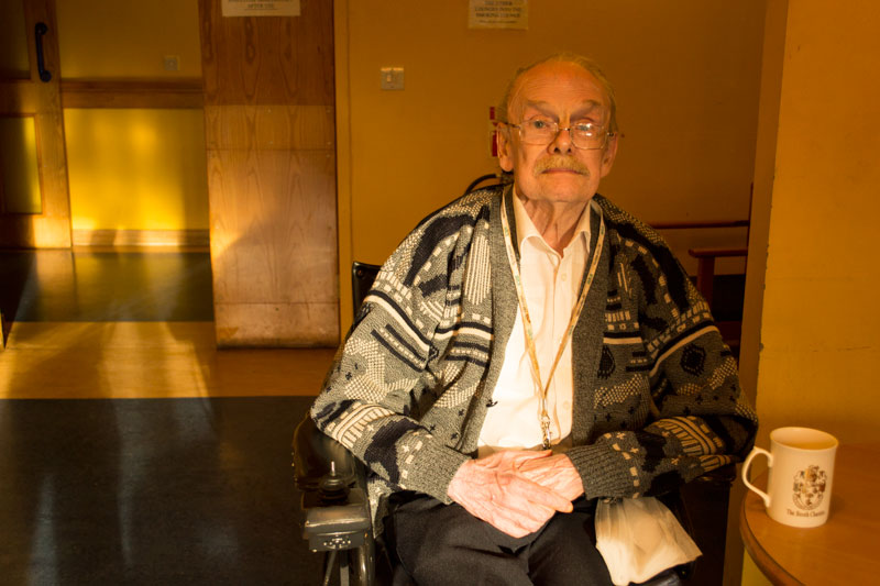
Harry Edwards, 88, Military Provost Staff Corps.
f5.6, 1/80th, ISO400, 22mm.
Composition was key here. I definitely wanted the Pietro Annigoni's 1955 portrait of the queen (1) in the background, but I wasn't sure about the tree (I thought it too seasonal). This one worked best because its shot at eye-level, indicating equality with one's subject. Below are some of the variations to this theme.
 |
| Shooting from beneath the subject is never recommended in portraiture , and this shows why: the composition is too awkward, accentuating Harry's crouched posture, and doing him no favours whatsoever. |
 |
| Shooting from above gives am equally detached feel to the image. The viewer almost strains to look at the subject. |
Later in the afternoon, I shot more of Harry in the Smoking Room (below).
 |
I was quire interested in having some of the old men smoking, but a lot of them didn't turn out right (see Richard below). However, I very nearly chose this as part of the final ten: I just thought it too close in relation to the other ones (32mm).
 |
| The issue with smoke, is it tends to distract from the subject's face. |
 |
| I've always liked the contemplative portrait, especially with old people. It was what I was going for two years ago when I did a shoot at Auden Court. |
|
 |
| I started turning a lot of the ones I didn't choose into black and white as an attempt to create the effect of JM Mortram (Small Town Inertia), or perhaps the people from the nursing home in Saigon that I mention in my research post. |
|
 |
Raymond 'Rory' Riding, 71, Lancashire Fusiliers.
f5.6, 1/50th, ISO800, 18mm.
This is the widest angle I used at 18mm. I like these wider types of portraits. A course mate offered some constructive criticism by announcing I had to many of my subjects resting in one of the thirds of the frame. I disagreed because it was my intention to have the background environment as prominent as possible, but nevertheless I appreciated her words all the same. Rory's room was very dark, causing me to up the ISO to 800, then try my utmost to pull the detail from the shadows in photoshop (Image>Adjustments>Shadows/Highlights). Richard Gaskille told me to send at least 5 versions of the same picture at different brightness settings, but even with a brightness of +30 the background was still too dark on this. See for yourself below.
 |
| See what I mean? |
Below are some of the others of Rory:
|
 |
Clifford Blood, 93, The King's Own Royal Regiment.
f5.6, 1/50th, ISO400, 22mm.
I was concerned there was too much orange and beige here. I shot all my images using the Shady White Balance just to give them that homely feel, but I can't help but think Clifford's skin tone merges with the furniture a bit too much. Also a lot of detail in the clothing of this and many others were lost in the shadows straight from camera, which I remedied by boosting the overall exposure and masking out every thing but the jumper with a black mask.
 |
| This was one I could have gone for. |
|
 |
Arthur 'Eric' Watkins, 89, Royal Navy.
f5, 1/40th, ISO400, 20mm.
I've known for a long time that Eric has a perfect face for a project like this (even another member of staff said it). Added to this is the fact he wears his old naval medals at all times. I like the way the composition leads us to the other two empty chairs. Somewhat reminiscent of Richard Gaskille's image that I used in my research post. Empty seats just seem to invoke someone missing in these scenarios, whether if this is the case or not.
 |
| I tried one from the opposite side, capturing the buzzer the residents press when in need. Gives a sense of the environment we are in, this. |
 |
| I said there was another ten of a lot closer shots. There is no doubt this would be Eric's one in that collection (29mm). I love the formal nature of his face. |
|
 |
Malcom 'Mike' Waites, 77, RAF.
f8, 1/125th, ISO400, 32mm.
This is the only one whose subject is not looking at the camera, but I didn't care: I just love the lighting in it. Many of the residents sit in the same spots day-in-day-out. This is Mike's. I noticed him sat right in the middle of the late morning light, and I had to take this candid shot of him after the previous ones of him in the smoke room were less than impressive (below). I used f8 because the light from the window really was quire severe. Obviously, this threw the background into complete darkness, meaning again I had to do my thing with the Shadows/Highlights adjustments layer.
 |
This is the original straight from camera. Way too dark, but I knew there was an image there.
 |
| I think this was the only other one of Mike I could have used, but at the time I didn't think very much of it at all: what I thought was my distracting shadow in the doorway, I now feel brings an abstract edge to the image. Retrospect is a great thing in the editing process. |
|
|
 |
| Rabbit caught in the headlights doesn't really work in portraits, as I learned on level one. |
 |
Kenneth 'Ken' Fitzgerald, 84, Royal Artillery.
f5.6, 1/50th, ISO800, 24mm.
Much like Harry's picture, I wasn't sure about the xmas tree in the background here. I do like his expression, though: very placid. |
 |
Duncam Smethurst, 82, 7th Queen's Own Hussars.
f5, 1/40th, ISO400, 22mm.
This is the brightest of the ten. However, I was concerned about a shadow that covered Duncan's left eye, which I removed with a mask. Also, like an idiot, I left my notes on his bed, so had to clone the creases in the sheet to cover this.
 |
D'oh! You can also see the shadow I mentioned here.
 |
| Alternative composition shot from the opposite side. Feels way too cramped to me. |
|
|
 |
Jack Godbert, 89, Royal Navy.
f5.6, 1/100th, ISO100, 18mm, flash.
This was the only one of the ten I shot using flash, largely because of the fact Jack was sat away from all light entering in through the main windows. I mentioned whilst discussing Rory's pictures that I didn't want any miserable faces, which is why I was doubtful about this one, but I sought reassurance from both my tutor and a few other students, the consensus being I have captured his natural mood on the day. |
 |
Robert 'Rob' Bailey, 54.
The youngest person in the home. There is a very relaxed feel to this, and I feel the different colour groups (black, red, yellow) adds to the 'lounging' mood. Its one of my favourites because of this. I remembered the advice of Richard Gaskille (tutor): “don’t even think about the camera at first, and concentrate on talking to the subjects to get them relaxed” (paraphrased) |
I also experimented with flash (including the diffuser I'd borrowed from the college with the orange and blue discs), but I realised early-on that this tended to completely obliterate the dominant mood in the rooms. Below are some examples of this.
 |
The orange diffuser warmed the highlights a tad too much, especially since I was playing with a yellow background. Note the way Richard's head blends with the wall.
 |
| A lot better without the diffuser. More definition in the face. |
 |
| There's nothing wrong with this picture. Its a good picture. It just wasn't what I was aiming for. I've mentioned the miserable point, but this is just too smiley. Maybe John's relatives would adore it, but it lacks mood for me. |
|
 |
| Its the same with this. Its just too basic. As I have mentioned before, there are those who take pictures of objects and those who take pictures of the light falling on those subjects (3) |
I'll leave this point about photographing light as my parting thought. My main intention was to make best use of available light on the day. This would include using a lot of natural window light. Of course, when we set out on such a task (especially for me, who only had the basic kit lens at my disposal) we are at the mercy of the light on that given day. Although the light was more than manageable (and very nearly perfect in some cases, during some parts of the day), the residents' individual rooms were lacking, meaning I had to improvise to get the best out of my camera (you will note how I have used ISO800 in some, and slowed the shutter to 1/40th in others, but mainly moving and directing my subject was the key variable).
Of course, we are naive to overlook the importance of post-shoot processing in images such as these. I shot the images in RAW, meaning- even with the likes of Rory's image, which was the darkest- i could reveal at least some of the detail from the shadows in the background (to show his environment, as intended). And it was during post-processing these images that a course mate introduced me to the
Shadows and Highlights Adjustment, which turned out to be a godsend in lessening shadows, especially when it came to sending for print: as an act of quality control I like to convert to the images back to the sRGB profile to lessen the shadows more (or whatever edit), then convert it back to the DSLustre profile so it would be ready for print again. I would then open the image in Windows Image Viewer to give a more random view and the element of detachment from Photoshop (since I figured this is designed to make all images look good).
Sometimes I work too hard!
1) http://www.philosophyinaction.com/blog/?p=6011
2) Digital SLR Photography, November 2011, pg52.
3) Demolder, D (2011), Advanced Photography: Camera Skills,
p36, free with Amateur Photographer, October 22nd 2011.


No comments:
Post a Comment